Tuesday, 16 January 2018

When Worlds Collide pt 2

For the second part of the brief 'When Worlds Collide'- we were given two lists of different words, in which we had to pick one word from each list. There were many different words to chose from, all of which were very interesting. However, after a lot of consideration, I chose 'Defining moments in history' from list A, and from list B 'Childhood'.  I chose these words as I thought they were both quite broad in their meaning- but that I could also make them very personal to me. I feel that a lot of my work is from memory of people, which is why I chose ' Childhood'. 

In November I visited the Pompidou centre, in Paris. I saw a range excellent work- including this painting below. However, I am still uncertain of the name of this artist. This painting depicts two dark haired woman, whom I assume are without clothing- and it appears as if they are holding onto some kind of light clothing to cover their bodies. When I first saw this painting I was fascinated by how it was so beautifully vivid in its colour- as the artist uses this mesmerising turquoise- yet so watered down; provoking such a strong sense of tranquility and peacefulness. I was slightly hesitant at the beginning of the project, with where and how I was going to even start this project however, it wasn't until I came upon this image- a whole range of ideas sprung to my mind. This was when I decided that I wanted to use watercolour in my work. 


I have always been interested in watercolour painting, and became particularly involved with using it in my work when I was doing my A Levels. However, it was not until now that I realised it was something that I really need to get back into. As I am usually very precise, and fixated when it comes to my work- I love how watercolour allows you to work in a more spontaneous, liberated way as you never really know what the outcome of your work is going to look. 

Over this past week, I have been painting small compositions of my friends, family and myself using water colour, and working from photographs. Whilst doing so, I wanted to retain the same watered down appearance as the artist had created- whose work I saw at the Pompidou centre. I deliberately chose to not paint their facial features, but only distinctive features of these characters. However, I am still undecided on whether I will draw in their faces using pen, watercolour  or completely leave their faces blank as they are now. 

In terms of developing my work, I would potentially quite like to experiment with putting these paintings into photoshop and turning them into negative images, which would make the colours much more luminous, and ultimately create a more sinister appearance for these images. However, I feel that they are already quite successful in their colour, and I really like the subtlety of the way the paint in some of them merges into the white background. 


Developing my work 

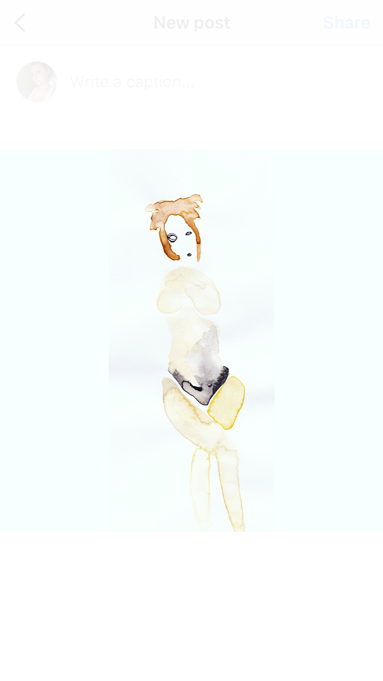
These past few days, I have been thinking more about how I can develop these compositions; in which I decided that I would like work into them- using black pen. The unusual marks that the watercolour has created, works quite well against the contrasting simplicity of the black pen; and over this week I have produced around 20 different compositions. 

Here are some of the final compositions. 

Charlie, My brother. 

Self Portrait 

Emerald, My sister. 

Jess. 


My Brother, Charlie.

This was painted from a photograph of my brother; I wanted to really accentuate the bold features of his outfit, such as his dark blue t shirt, his light orange hat, and his cold red lips. I like the way the paint in this image, merges in such an interesting way-  creating all of these wonderful and unusual marks. Once the image had dried, I drew into it by only drawing the eyes- as I didn't want to over complicate the image. From looking back at this composition, I think this one is the most effective image- as the simplicity of the eyes, really contrasts against the intricate detail of watercolour marks. 

Self Portrait.


Self Portrait.

Self Portrait.


Jules.
Self Portrait. 

Evaluating my work

Once I had completed these compositions, I used Instagram to further edit these images- simply turning up the contrast, saturation and highlights of the compositions. I'm glad that I edited them further as they were looking rather dull, before I had done so. I use Instagram all the time to edit images of my work, so this process was quite easy for me.

I am extremely pleased with the outcome of these compositions; particularly how the watercolour creates such interesting, and unusual marks within the composition- its actually rather beautiful. However, I also think these image are successful due to the simplicity of their faces drawn in pen against the intricate detail of the watercolour marks.

In terms of developing my work; I would defiantly like to experiment on a larger scale, and possibly contribute different materials onto the faces of these images- possibly start using paint or pencil to draw their faces. Make them slightly more abstract and less cartoonish. Although they do work well on their own, I would like to see what these compositions would look like with backgrounds.

Over the holidays I have been looking at many portrait artists such as Marlene Dumas, **3 others** all who which hold a very important influence to my work. I first became sufficiently interested in watercolour during A Levels- however, it is a medium that I haven't really come back to until now.


Monday, 15 January 2018

Drawing Upon Inspiration- Experimenting with Sculpture

For the past few weeks I have been primarily focusing on drawing women in all different shapes and sizes. Although I was pleased with these drawings, I felt a little bit stuck with how I could develop my project further; this led me to the decision to experiment with a different medium, sculpture.

Since my earliest interest in art I have been fascinated by depictions of the human form. It has been an obsession of artists forever – think of Michelangelo, Rembrandt, Picasso, Giacometti, to name just a few. And right now we are preoccupied with our bodies –  think of how much we think obesity and diets, zero-sized models and plastic surgery. Painting and drawing can take you so far – and I have been pushing at the edges of what I can achieve. But sculpture opens up a third dimension – it’s like I am moulding flesh and I am excited about how I can bring something palpable and visceral into my depictions of the human form. The imperfection of these shapes is part of the point – our bodies ARE imperfect, but as a society we find it hard to accept that and obessess over trying to achieve the unattainable perfect body. 

From the images that I had previously drawn, I decided to turn these different drawings of women into miniature sculptures. For my first sculpture, I wanted to experiment with Plastercine (Newplast brand) as it is a very flexible material. Although it doesn't dry completely, you can mould it into any shape you wish too without it breaking apart or going out of its position. When I first used it I thought that I might be able to heat it in the oven to harden it however; after some research I learnt that doing so would actually melt it completely. So I left my sculptures to air dry.

Whilst creating these sculptures, I also experimented with another type of material, a clay called 'DAS'. However, I did not feel satisfied at all with this product, as it was very difficult to mould together. Although, I did try wetting the clay to make it more flexible, it would not stick together, and was very time consuming.  Eventually, I realised that using this product was not for me, and reverted back to using plastercine for my models.

These are the final results of my sculptures.


This sculpture was much larger than the other models, using up a whole packet of plastercine in its creation. Before I had made this sculpture, a lot of my other models had very tiny physiques; which led me to the decision to make a much larger model. Although, it's not necessarily as perfect in it's appearance as the others, I found this model the most interesting one. 


Conclusion 

Creating these sculptures was a very enjoyable and interesting experience; as I was able to experiment with the shape and sizes of these models figures. Although I did have some complications in the process using other clay material- I discontinued using this; and I eventually produced around five different models using plastercine. I had never really experimented with sculpture before this project so it was very interesting to see what the outcome of these sculptures was going to be. I have realised now that I would defiantly like to incorporate sculpture into my work again in the future; particularly with using plastercine, which is a very easy and flexible material to use. In terms of improving my project, I think that I would have made more plastercine models, making some larger ones, given more time.

Cutting out stencils for Screen Printing

Over the past couple of days, I had been creating different designs for my screen prints; the next part to this process was turning these drawn designs into stencils. Using newsprint paper, a very particular, thin paper used specifically for screen printing- I traced my drawings onto this paper, which I then cut out using a stanley knife. This part of the project, was quite interesting, as I was able to sort of see what our designs would look like turned into prints.

However, this process did come with many obstacles on the way firstly; I had to take extra care in cutting out the stencils, as the paper was so fine that it kept tearing quite often whilst I was cutting it- which became rather frustrating. Another challenging aspect of this process, was making sure that I cut the right part of the stencil; quite often I would accidentally cut out the wrong part of the stencil- leaving it to look completely different as to what I had hoped. Lastly, including detail into my stencils was quite difficult, as I had to be very precise- but I also felt quite limited as to how much detail I could include, as I knew that the paper would rip when it is printed, if it was too detailed.

I am still optimistic about screen printing next week, and I have produced around ten stencils already, most of which I am very proud of. However, I did find that cutting out the stencils today was very challenging, as the paper is so fine, and it was very difficult for me to include detail in my work, as I am not very experienced with this process. I am also still rather nervous about how these stencils will look once they are printed out eventually, as I have never done screen printing before.


Sunday, 14 January 2018

Working on a larger scale

These past couple of days have been very exciting, as I have been experimenting with working with much larger water colour compositions, in response to the When Worlds Collide project. As I'm usually very precise with my work, I tend to get caught up with going into too much detail, which is very time consuming but also drives me to this idea of 'perfection', which isn't always achieved. I tend to think that art isn't always actually that good when it's considered as 'perfect'; the more bizarre the work, the more interesting. This is something that I've been trying to accomplish in my work recently; instead of focusing on very 'idealised' portraits, I have been trying to make my portraits as quirky and eccentric that I possibly can.

I really enjoy using watercolour as a medium, as it allows me to work quickly, and spontaneously; but most predominately, I never really know what the outcome of using it is going to be, which I find very interesting. I have also particularly enjoyed working on a larger scale these past few days, as it has really allowed me to go a bit crazy with the paint; but I also feel that I have taken a few more risks with these larger compositions as I have more space to experiment onto. 

Artists such as Marlene Dumas, and Sally Bourke have a very predominant influence on my work- as they also use watercolour as a medium for their own work. Marlene Dumas is such an influential artist for me, as she captures emotion so clearly in her portraits but not in way that would be considered 'beautiful' or 'idealised', but in a way that can actually be quite shocking and grotesque. I hope that by the end of this project, that I have succeeded in portraying emotion in such a way that Dumas does in her work. 


Usually, in preparation for a water colour painting, I will find a photograph that I like- whether that be one of friends, family or myself. Choosing an image to paint is quite simple, as I just choose it depending on the images colour or formality that I like.


Above, are a few of the larger scale paintings that I made using watercolour. For these images, I wanted to capture the most significant part of the photograph, whether that be their hair, a hat, or their clothing. I think these images look quite interesting without any facial features, it sort of creates a mysterious effect- as if we don't know what the people in these portraits look like, but we can only see their most significant features. I also like how t


These are some of the original portraits in which I worked back into, either using black ink pen, or pencil. I think the effect of both of these techniques is very effective, but also very different. The black pen, which was my original technique for this project creates a more cartoonish effect, which I do like however, I think the use of the pencil creates a more subtle, and fainter effect to these portraits. 


Creating larger watercolours

This week I have been working into my large watercolour paintings, although I am pleased with the outcome of my previous images, I also feel that I needed to make them a little bit more expressive in their composition. I usually have the tendency to really fixate into detail quite often, which is why I felt that I had to really push myself into trying to not care as much about these images being 'perfect' or 'idealised'. These are some of the images of todays session: 


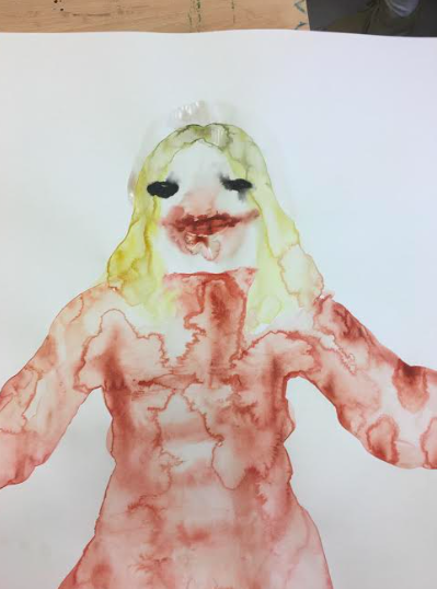
This was a portrait that I did of my sister form christmas. The original image is very warm hearted, depicting her  posing, showing off her new red dress, with a big smile on her face. However, in my portrait of her, I have turned this warm image of her into something rather sinister, and quite frightening. Her make up, which was once perfect and flawless- now drips, and smudges all around her face. Her bright blue eyes are now black. Overall, I am very pleased with the outcome of this image, I think the bright, warm colours of her hair and dress work very effectively, juxtaposed against the blackness of her face. 


Self Portrait 


I am very pleased with the outcome of this image, as I think I feel that I've been successful in creating this very creepy, sinister appearance. I initially began to paint this image very small and precise however; after accidentally spilling some water around the mouth, I decided to not care too much about the appearance of the image, and just continue with painting more red around the mouth.


From looking back at my work, these portraits held a strong resemblance to the character 'The Joker' from the film Batman Begins. 

Thursday, 11 January 2018

Chaim Soutine

Another major influence for this project is the work of Chaim Soutine; a Russian-French expressionist painter whose most important paintings were made after World War 1. Similarly to many other artists that I have studied, Soutine creates has his own personal, distinctive style- creating a sort personality for each piece. What struck me most about his work, is not only the abstract, deformed appearance of these portraits- but the vibrancy of colour that he uses in his work.

However, despite these paintings being so vibrant in their colour, this is is completely juxtaposed in their ghosty appearance. Possibly it's the texture that Soutine adds to these portraits- sort of creating the illusion that these people are sort of hovering in front of us. If i could imagine a ghost, i would imagine it like this.They are almost cartoon-like- with these accentuated features, huge ear, wide eyes, long faces.

Soutine is hailed as an expressionist, and I don't think that he is interested in trying to recreate an objective 'real' world. His paintings are highly subjective, driven by powerful emotions. These paintings are insight inside his head- not so much it looks like, but more what people and urban landscapes feel like. 


Here are some of my most favourited pieces by Soutin.


This is one of my most favourited pieces of Soutine's titled 'Bell Boy' painted in 1893- 1943. Soutine uses such a powerful intensity of vibrant red, which is contrasted  against the black background- really emphasising the Bell Boy in the centre. Turned this bell boy into something of a glamorous nature- bursting with this red vibrancy- looks like a prince. 

I can really imagine this boy sitting down like this, waiting for someones luggage to take. 

-misphaped body- looks like a characterure 


Wednesday, 10 January 2018

Sally Bourke

I have become completely indulged in the work of Australian portrait artist, Sally Bourke. Bursting with colour and vibrancy- Bourke paints the most extraordinary distorted and unsettling portraits. Like many artists nowadays I found her work on Instagram, and became instantly obsessed and fascinated when I saw her work. Although, many of her paintings are so vibrant, and warm in their use of colour- this strongly juxtaposes with their unsettling, and almost terrifying facial appearances. But what is most interesting about her works, is that each painting retains its own personality, and style. 

When describing how she creates these portraits Bourke explains, 'The faces and scenes that I portray in my work are attempts to make reconciliation with my past, live in my present, and imagine the future. I paint people from the inside out'- I found this sentence rather beautiful. I also find that in my own work I like to also paint from memory of people- but not just how I perceive them from the outside, but from the inside too. 

From researching many of Sally Bourke's different, and unusual pieces- I hope that I can produce work as interesting, and unusual in the very near future. Her work has also made me think about producing a series of portraits on a larger scale, which is something that i have not experimented with yet. 

These are some of my most favourited works by Bourke. 


'You Know I dreamed About You' 


'The Other You'- Oil and Acrylic on archival mount board. 

There's something almost childlike about this composition; although, it is so disturbing and ominous in it's appearance- there's also a sort of warmness that this painting portrays. Bourke's use of colour in this image is so imaginative- depicting vibrant pinks and deep blues, which merge into this characters long black hair. The features also make this painting so compelling- it's like we're trying to make out who this character could be underneath this mask of paint. 

see through to this nightmarish smile that lies underneath the paint. 


Home Duties- Oil on Ampersand. 


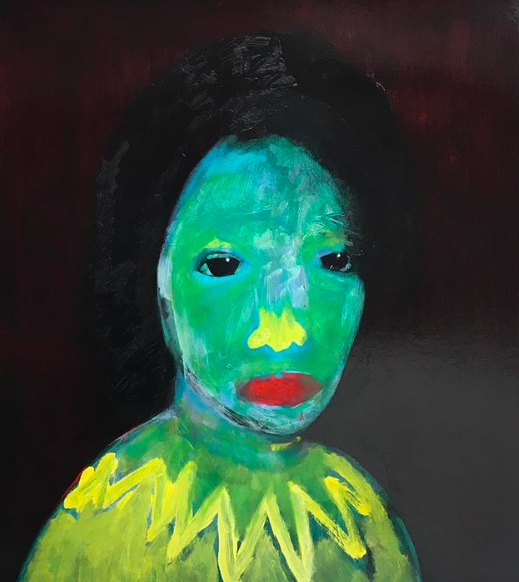
'The Green Lady' - Oil on archival mount board. 

'The Green Lady' provides such a powerful intensity of vibrant lime green which is juxtaposed by the stark contrast of the luminous dark background; it almost appears as if this green lady has suddenly submerged from the darkness. Looking closer at this image we can also see that there is a very subtle light red, faintly outlining around the woman's hair. Bourke has clearly tried not to idealise this image- which is shown through through the harsh texture of the skin, which appears to be sort of carelessly smeared on. This unsettling element is reemphasised by the two beady black eyes, staring straight at us. 


Tuesday, 9 January 2018

When Worlds Collide

Screen Printing

As our final project prior to the christmas holidays, we were all given the opportunity to experiment with screen printing. Put into groups of two, we each had to choose a word from a list- which we then had to combine with our partners chosen word. My partner Sophie, had chosen the word 'ritual', whereas I had chosen the word 'mask', although these words were both entirely different in their meaning, it was still very interesting to see how we could create a series of screen prints from these words.

We began to focus on the meaning of the word 'ritual'- 'a set of fixed actions performed regularly'. It was very interesting, as we began to brainstorm different rituals that are part of our everyday lives- although this was rather time consuming, we eventually came up with this idea of 'the rituals of love'. What are these different rituals that occur between couples? I began to draw some very rough, simple designs of couples doing different things; whether that be kissing, holding hands, hugging etc. however, whilst drawing these designs I still wanted to retain this very creepy, sinister 'mask' like appearance between the couples.

Here are some of the designs that I created prior to the screen printing:


 This was my first drawing of a couple that I made in response to the 'rituals of love'. Brainstorming for this part of the project was quite enjoyable, as I had to think up all of the different ways that couples could be perceived. This image, which I just made up in my head- is supposed to depict a couple resting against each other, as their hands are locked together; whilst still retaining this 'mask' like appearance. I like the simplicity of this image, and it also reminds me of my boyfriend and I.


This second image depicts a girl crying. My partner Sophie had previously drawn some portraits where the eyes had little squiggles lines underneath them, creating this weird, quirky illusion of tears. I really liked this little technique that she had done, so I decided to incorporate it into my own work. In this image, the girl is sitting down, looking out the window crying. I think this image works successfully as it is very simple like the others; I'm still not sure if I will able to screen print the squiggly lines underneath her eyes as they are a bit too small and precise however, I thought that I could always draw them back on once I have made the screen print.


This was defiantly my favourite design out of the others. As we were focusing on the 'rituals of love', I knew that it would be interesting to try and make a design of two people kissing. I like how their tongues are intertwined together; which sorts of creates this creepy illusion that their tongues are stuck together. I think this image is also successful through its simplicity, the tongue and mouth art very detailed which lets the viewer focus primarily on the tongue. Once I had drawn out this image, I thought that it would be quite interesting to experiment with water colour; in which I used to paint the tongue. I didn't want to make the colour of it too bold, so I lightly dabbed around the edges of the tongue with red, which I kept layering over and over again with water, very lightly. Overall, I am very pleased with the result of this image, and how the redness of the tongue is very faint.


Overall, I found this part of the project very interesting as it allowed me to really open my mind about the different ways that couples are perceived. On the one hand, i wanted to make these drawings, and my prints retain a very romantic feel however, at the same time depict also a very sinister, unsettling appearnace. Not only was it very enjoyable working in a pair, it is also very interesting to see how different your ideas can be from one another, and combining your ideas. I think working in a pair in some ways was quite challenging for me, as on my own i can become very fixated in my own style, which was why it was so interesting to work with someone else as they can actually really inspire you to become more open minded.


Let There Be Light part 1

For our most recent project, we were given the title 'Let there be light, a photography project in which we had to explore the differen...